


Before and after: inside our bathroom renovation (and the guilt that ensued)
A modernist-inspired makeover.

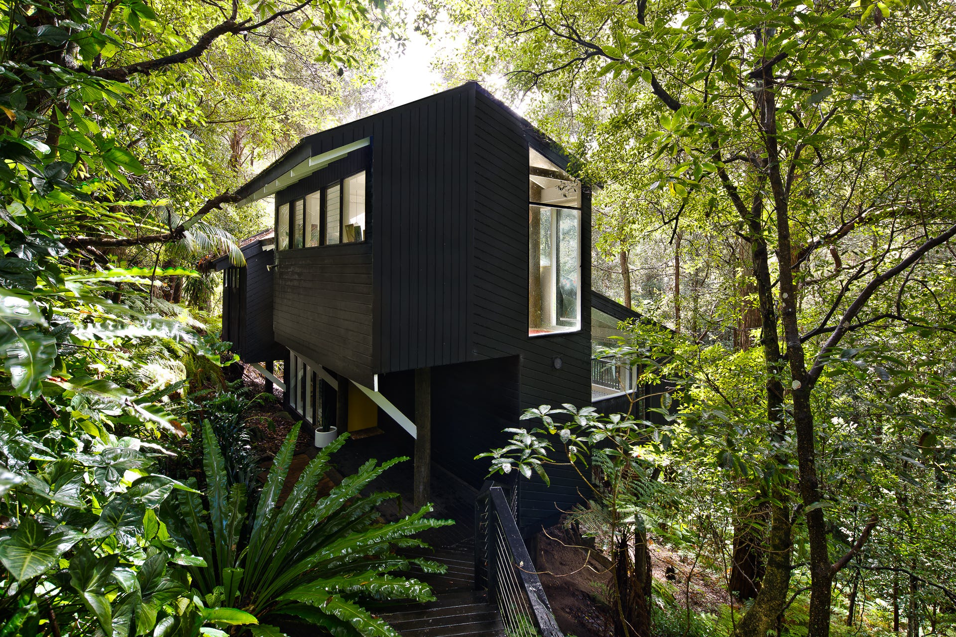
We live in a 1970s modernist-style pole house in Sydney’s bushburbia, and over the past ten years, we’ve been slowly renovating it, one room at a time. It’s a good example of ‘The Sydney School’ of architecture in the ‘60s, ‘70s and early ‘80s: it’s built over five split levels on a sloping block in Sydney’s bushland. It has an asymetrical design with exposed timber beams and poles throughout the house and a combination of large floor-to-ceiling and clerestory windows.
Our bathroom began life as a classic ‘70s ensuite, fitting right in with the home’s original character. The ‘90s tried to rescue it with a makeover – lots of stark white tiles and white pebbles in an attempt at personality – but the result was more muddled than inspired. The real showstopper was a custom timber vanity with a sink cut out in the shape of a leaf – quirky, but also a bit impractical as it was irreparably damaged by water. By the time we got to it, the room was worn out and just didn’t work for us anymore.

Storage was another issue: just one large mirror with no shelving, and the few drawers that existed were heavy and awkward to use. I knew I wanted soft-closing, pull-out drawers for easier access and better organisation, and I was determined not to repeat the mistakes of the past.
I do feel a bit guilty about changing the look so much. And yeah, I painted the ceilings and walls white. The retro home Facebook groups – of which I’m a member – are probably sharpening their pitchforks as we speak. I don’t blame them. But those ceilings weren’t lovely wood-panelled ones; they were a particularly neon shade of orange.
Still… the guilt lingers, especially since panelled timber walls and ceilings are a key feature of the Sydney School of “nature-responsive modern houses”. And that timber vanity was clearly somebody’s labour of love, custom-built for the space. I just couldn’t live with the orange. It particularly clashed with the grey-brown-green tones in the timber poles throughout our home.
From the very beginning, I wanted to honour our home’s 1970s pared-back modernist roots while creating a bathroom that was both beautiful and practical. I was eager to seek out independent Australian brands with real design chops, and to introduce just the right touches that would make the space feel unique – without tipping into anything too flashy.
Let’s get down to the details… and at the end you can tell me if I did the right thing.
Tiles
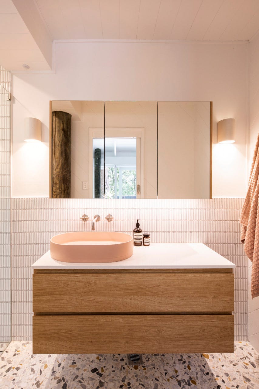
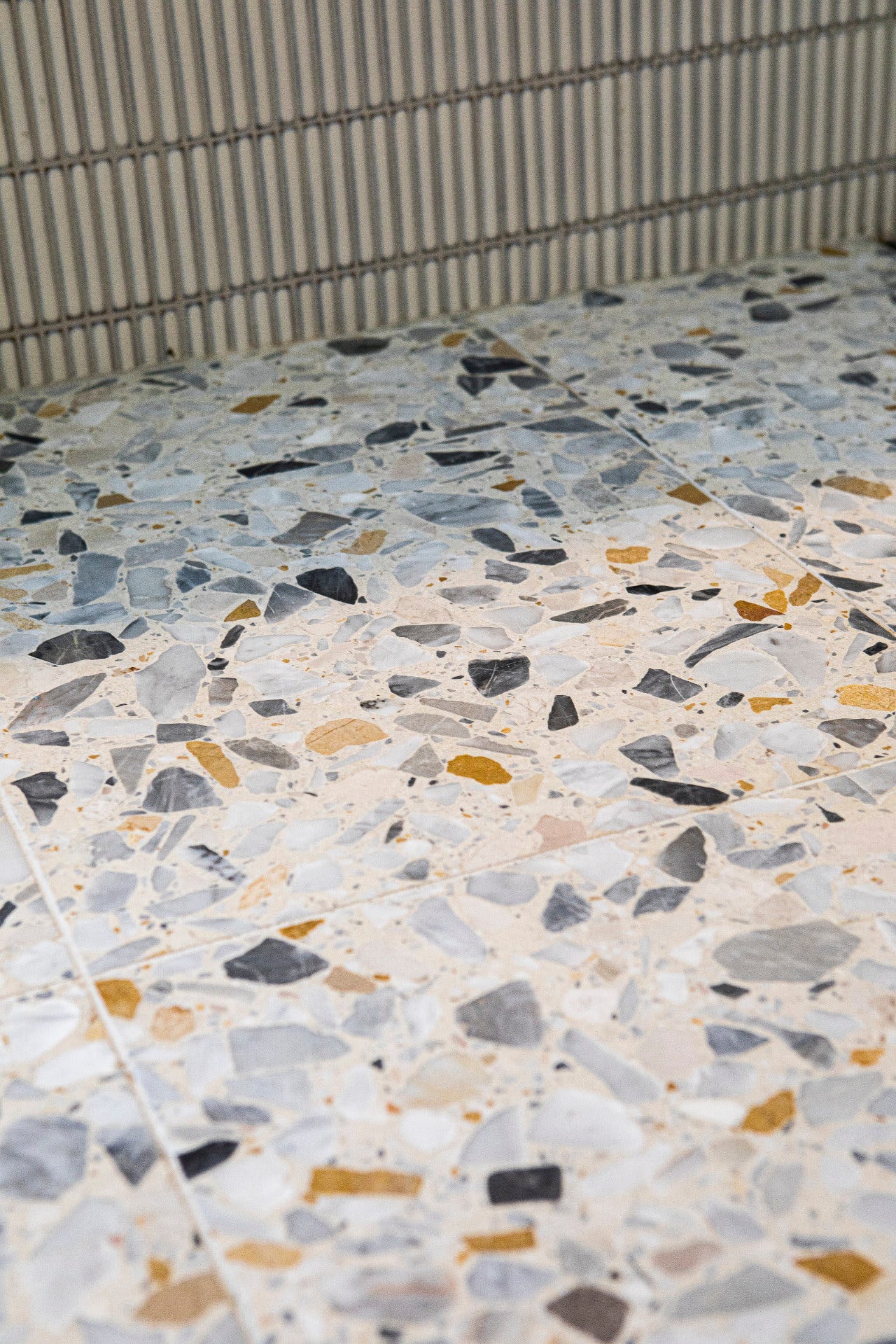
I began with the floor, choosing terrazzo tiles from Lulo Tile – Terrazzo Grande in Ciottolo Grande by Vulcano Terrazzo. They have a creamy white base with extra-large flecks of Carrara, mustard-beige and pink Zandobbio marbles. These tiles have a timeless yet distinctive quality that nods to the ‘70s. They also complement the timber pole, which remains a defining feature of the room. We installed underfloor heating as a luxe touch, and since we’re tucked down in a gully, it’s worth every. single. cent. in winter.
Tapware
The brushed nickel tapware is from Brodware, an Australian independent brand known for their design authenticity and artisanal craftsmanship. I chose the brushed nickel tapware from their Yokato collection because it provides a softer, more sophisticated alternative to stainless steel. I also wanted to avoid any trends like matt black tapware (a mistake I made in the kitchen) and the traditional crossbar design offers a subtle retro nod.

Sink
For a touch of whimsy and an homage to vintage bathrooms, I chose a pink concrete sink from Nood Co. They are a Perth-based company renowned for its handcrafted concrete basins and bathtubs. I love that the concrete is a nod to brutalist design, while the soft pink oval shape offers a more organic feel. The hue also reflects the pink Zandobbio marbles in the terrazzo floor. I also chose towels from Aura Home in a soft blush shade that mirrors the pink in the sink and terrazzo floor, gently tying the entire space together for a harmonious finish.

Storage
The wall-hung vanity from Timberline's Nevada collection in 'Elegant Oak' combined with a Caesarstone benchtop perfectly embodies the streamlined modernist aesthetic. I went with a laminate product as I was scarred by the damage to the existing natural timber vanity. It incorporates functional elements like hidden power points in the drawer and vanity to keep hair dryers and electric toothbrushes neatly tucked away. The matching "Denver" shaving cabinet completes the look, offering additional storage without compromising on style. We installed an LED strip in a soft warm light under the vanity, which offers automatic gentle illumination when you open the door at night.
Lighting
I wanted to incorporate an organic, handcrafted element into the space, and these handcrafted ceramic sconces from Tasmania ceramic lighting studio We Ponder softens the clean lines and brings warmth to the space.

Wall tiles
I chose mosaic finger tiles (aka KitKat tiles) in Coogee Antique White from Tile Cloud to add texture and interest to the walls. Their understated style ties everything together perfectly, creating a cohesive look that's at once contemporary and nostalgic.
Bringing the outside in
One of the things I love most about the bathroom is the floor-to-ceiling louvred window. It feels like I’m showering in a rainforest. It beautifully connects the interior space with the surrounding bushland, blurring the lines between inside and out.

Small details
The frameless shower features a niche with soft LED lighting that automatically illuminates when the door is opened, adding both functionality and ambiance.

This renovation has been a bit of a passion project – my way of tipping the hat to our home’s modernist bones, but with a twist that’s all ours. I wanted a serene bathroom that would fit right in with our ‘70s pole house and its leafy backdrop: a little ode to the best of Aussie design.
What do you think? Did I accomplish what I set out to achieve? Am I guilty of destroying the distinctly Australian vintage vibe by painting the timber panelling white? Gah. Let me know all your thoughts in the comments below.
If you’ve enjoyed this free newsletter or found it vaguely useful, do give the heart button below a gentle prod – it keeps the Substack algorithm gods happy and apparently helps other lovely people find Wee Birdy. If you fancy leaving a comment too, it would honestly make my day.
New to Wee Birdy? Read all about it here.
The exterior of your home is lovely Rebecca. I love the louvres, they frame that gorgeous view perfectly.
This is A Delight! My forever favourite thing is an opening window in a shower, just wonderful. I love KitKat tiles, but I think that you absolutely have to be onboard about extra grout upkeep - if that’s ok, then they are a modern and timeless joy.